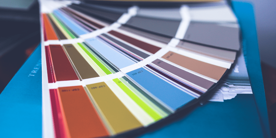
What colors say about your brand & packaging
The colors of the package that contains the product that a customer purchased from your company can single-handedly alter how the unboxing experience goes for that customer. Believe it, or not, the colors of a package can change the entire vibe of a product, and the way that a potential customer will view the company behind the product. To break it down in the most simple way possible, warm colors, cool colors, and neutral colors will all have different effects on a customer. Furthermore, each color within those designations will change customer perception of your package design even more.
Warm Colors:
Though it’s hard to generalize warm colors as giving off one general feeling, we can go through each one and talk about what each of them brings to the table. Red is typically associated with passion, and intensity, thus making it a good choice for something that wants to pop or be associated with high energy. Yellow is supposed to be representative of emotion, and emotional connection. It is typically used by brands to build a warm relationship with their customers. Overall, warm colors are typically associated with intense emotions in some way, and they help establish your brand with a consumer in a more intimate way.

Cool Colors:
Cool colors, unlike their warm counterparts, are prone to giving off less emotionally charged vibes to your customers, and, instead, will typically be more calming, and laid back for a consumer to view. The most commonly used cool color when it comes to branding and packaging is blue. Typically, the color blue is associated with trust, and intelligence. It’s also said to promote serenity and is typically associated with men. Green on the other hand is similar to warm colors as it is associated with excitement, but in a more reserved way. It is not an over-the-top color, and it still blends well into the background, promoting a calm emotional response. Another common color is purple, and variations of purple. This color is typically associated with femininity and is associated with peace and success. Cool colors are meant to calm a customer and make them feel secure. Check out our case study for MOOG Sound Studio utilizing cool colors.

Neutral Colors:
Neutral colors like black and white provide a unique twist on packaging. Black is typically associated with more high-end brands and products, thus making a package feel like it’s more luxurious in some ways. White is typically associated with purity, thus making a product seem more clean-cut and trustworthy. The two are commonly mixed together when it comes to both packaging and branding, thus creating a unique experience for consumers. It is intended to convey a luxury vibe that you can trust.

How to select a color palette
Missing the mark on the color combo of your packaging can be detrimental to the unboxing experience for your customer and can overall send the wrong message to your customers. When trying to make a color selection for your own brand and packaging you must bear in mind two important things: what message do you want your brand to convey to your customers, and who are your customers? Understanding these two things will lead you to selecting the right color combination for your product.
Brand Message:
When looking to choose a color palette for your packaging, you must first figure out what message you wish to send to your customers regarding your brand. This message will typically be dictated by what it is you’re selling. Are you selling makeup? Clothing? You don’t want to send too intense of a message to customers who are wishing to buy a simple product. You may also want to incorporate certain other aspects of your brand into your packaging through color. Are you environmentally friendly? Including the color green would reflect that commitment to the world. If you’re trying to establish your brand as being professional and serious, then make use of more neutral or cool colors. If you’re trying to establish your company as being more playful, or fun, then make use of warmer colors. Your brand value is an extremely important piece of the puzzle of selecting colors that work for you and the desired message that you want to get across, but the audience you’re looking to sell to is just as important in deciding what colors to use.
Desired Audience:
Your desired audience is the second biggest thing that must be taken into account before selecting the colors of your packaging. Your brand message will have an impact on who buys your products, and after you’ve settled on the kind of image you want your brand to have you will essentially have an idea of who will be your main clients. Now, the color of your packaging can work with those clients. If you want a mature, perhaps a bit older audience, you may want to opt for something in the cool category. A calm color will reflect the lifestyle of a calm, less active person. If you wish to attract young people to your product, opt for something more exciting, something more emotional, like the warm colors. If you know that your product will appeal mainly to women, or to men, then select colors that reflect as such. If you wish to stand out, you should also try to use a unique blend of color but try not to make them conflict with one another. The colors are there to accentuate your brand image, and attract customers, a conflicting color palette will get in the way of that. Basically, you should aim to appeal to those you see as most likely to gravitate toward your brand and image. Finding a color, or a group of colors to do so will be a great way to boost your customers’ unboxing experience and will increase your chances of attracting new customers.
Some stats on colors & packaging
To back up some of the information above, there are clear trends when it comes to who likes which colors, and how colors impact consumers as a whole. An article by Digital Information World reported that 93% of all consumers focused on the visuals of a product. This just puts even more emphasis on the idea that visuals matter most, and really have a deep effect on consumers. An article by the Daily Mail asserts that the color creates a sense of urgency in consumers and promotes buying products on impulse. It has been reported that the color blue is the most universally loved color, though this will vary from person to person. On the same topic, it appears that men are also more prone to liking the color blue, perhaps due to the fact that blue is typically associated with the gender as a whole. As a matter of fact cool and neutral colors as a whole seem to appeal to men, while women gravitate toward a select few cool colors, but mostly warm ones are used to appeal to them. All of this is just more proof for the idea that colors matter. When you bring colors into the equation of trying to sell something, you need to take into account what each color means and who it is most likely to appeal to and why. If you do not, then you run the risk of alienating the audience that you hope to impress the most.
How to Get Started Selecting the Right Colors for Your Package Design
We at Morrisette are committed to finding the right packaging solutions for your company. Our design center will help you design your packaging every step of the way from conceptualizing to production. We put an emphasis on the design of your packages, and how well they will perform their job. We will ensure that your packaging meets the standards of your company and reflects the brand that you wish to create. Our packaging will keep your products safe and secure and will build a style for your company that is sure to stand out. We won’t shut you out of the process either. You will be involved with us every step of the way, and we will ask for your input on every portion of the process. We want to work with you to create the best possible packaging. If you’re in need of any packaging solutions, contact us today, and we can get started with the process of designing packages that fit your products and your brand image.