Packaging design for companies in the food and beverage industry is growing exponentially.
The landscape is constantly changing with new demands and interests in food and beverage preferences. Your brand is continually pivoting towards those demands, and the end-user experience rests on how you address the changing trends in both product and packaging.
Environmental and supply chain pressures influence decision-making in food and beverage packaging. And a booming market increases demand for packaging uniquely suited to the brand and the customer’s expectations.
In particular, the American whiskey industry is on the rise. There are now more than 2,200 craft distillers in the U.S.
According to Forbes in 2021: “Consumer interest in American whiskeys, especially rare, ultra-aged, ultra-expensive expressions, is growing exponentially.”
And the Distillery Trail website hosts 2,218 listings for Craft Distilleries in the U.S.
Who Is Virginia Distillery Co.?
Virginia Distillery Company is located near the beautiful Blue Ridge Mountains. Their high-quality whiskey is designed to leverage the natural qualities that are home to Virginia:
Using the highest quality malted barley and fresh spring water fed from the Blue Ridge Mountains, our spirit was developed to leverage Virginia’s climate, allowing the broad temperature shifts to add depth to our whisky. Hand-hammered copper pot stills crafted in Scotland are used to distill our spirit using time-honored techniques. What makes us a distinctly American whisky and defines our signature taste, is our unique combination of casks aged in Virginia’s climate.
Virginia Distillery Co. website.
Quality is essential to their customers. Style and expression are important, and showing their brand identity (and history) is critical.
Virginia Distillery Company – an award-winning craft whiskey company – needed a packaging design that would allow it to stand out amongst the rapidly growing whiskey market competition.
Virginia Distillery Company embodies premium, signature quality. Here’s how we revolutionized their packaging design.
Virginia Distillery Company embodies premium, signature quality. Here’s how we revolutionized their packaging design.
The Design Process
The Virginia Distillery Company packaging design project came about as they were starting a new product concept: a sample kit of whisky bottles and glasses. The goal is to sell this blending kit in retail stores.
The distillery has a rich history and a firm commitment to producing high-quality whiskey. The combination of traditional techniques, innovative cask types, and the influence of Virginia’s climate adds depth and complexity to their spirits.
Our design team wanted to capture all of it in their packaging design.
As this was a brand new project for them – and us – the Virginia Distillery Company team did not have a concrete idea of what they wanted. They had a brief description of the product’s purpose, but it was our task to learn about their brand and bring to life the exceptional quality and taste of the product through excellent packaging structure and graphic design.
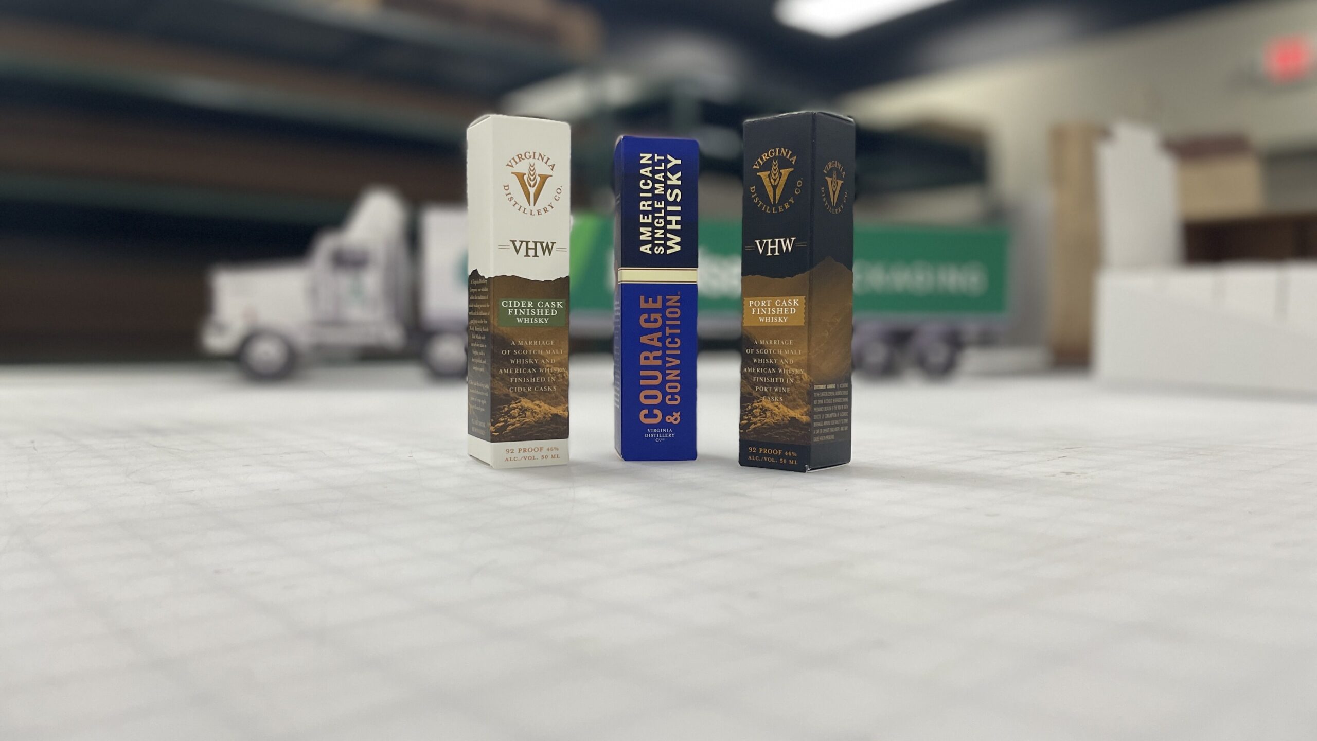
The Virginia Distillery Company marketing department provided artwork for the box, and we worked diligently to make the structure and artwork come together.
The Morrisette Packaging design team began mocking up samples and prototypes for consideration.
In this case, we fitted their art to our structure, ensured elements were set correctly, and produced samples.
The Result
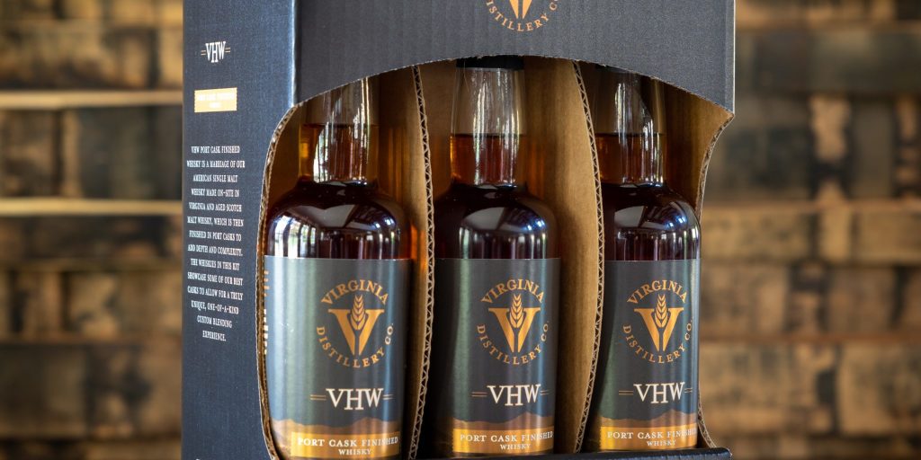
We collaborated with Virginia Distillery Co. to create packaging for retail environments that is appealing, tells a story, and protects Virginia Distillery Co.’s product and brand legacy.
From a structural perspective, it was designed to fit three whole bottles: one empty, one with a beaker, and a Glencairn whiskey drinking glass.
The glass objects inside the package stay protected with a divider system, which keeps them separated. We left the visible divider edges raw when looking at the front of the package, as the fluted medium ties in with the mountain-themed graphics.
Here is the final result:
Since this order, we have received more purchase orders for different projects with Virginia Distillery Company and we can’t wait to share those designs with you in the future.
Learn more about our packaging design center
Contact a Morrisette packaging design expert
Categories: Case Study, Packaging Design